Always up to date, open to the world inside and outside Dell.
Art Direction/UX/Dev/Management
Designers have always held brand guides in high regard, but the honest truth is that this is a work horse not a show pony. Over the several versions building and managing the digital brand guide, I worked with stakeholders to stress issues like fresh product photography direction, new typography styles when an exec dropped a new font, icon usage and design, even applying brand to architectural designs. Meanwhile, despite the gems we polished so well, users most needed 2 things: accurate color values and a link to download the logo.
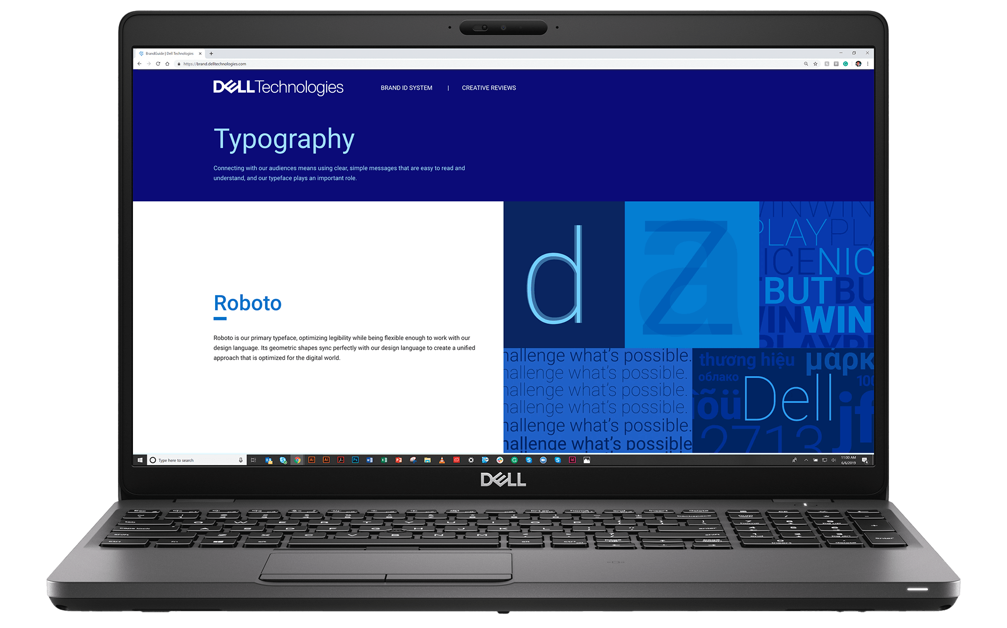
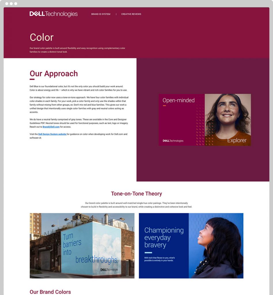
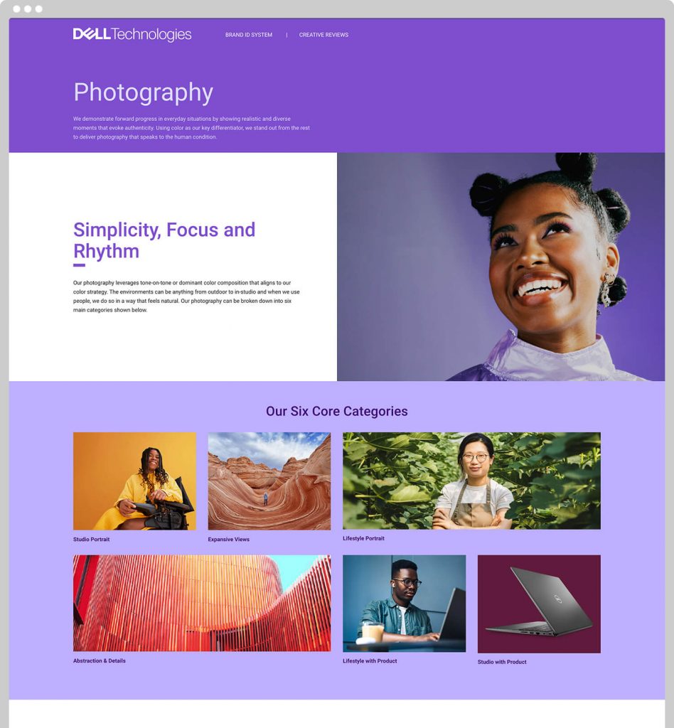
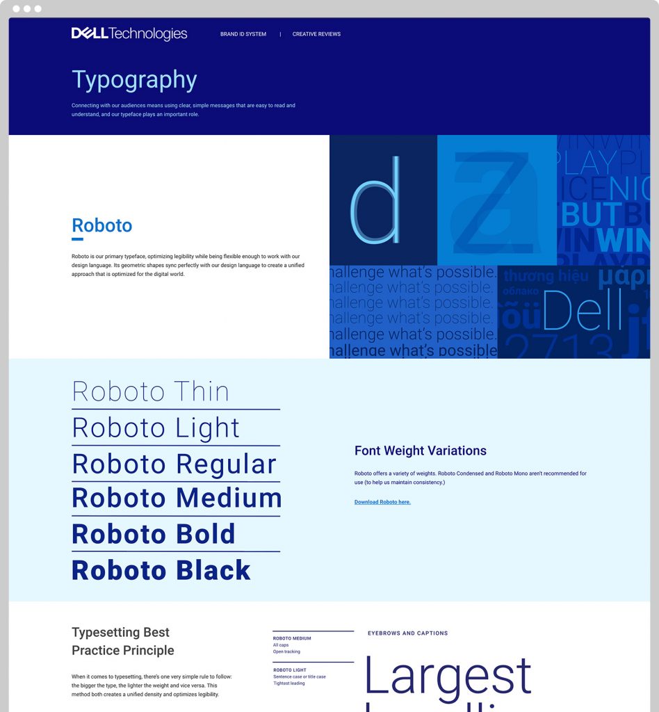
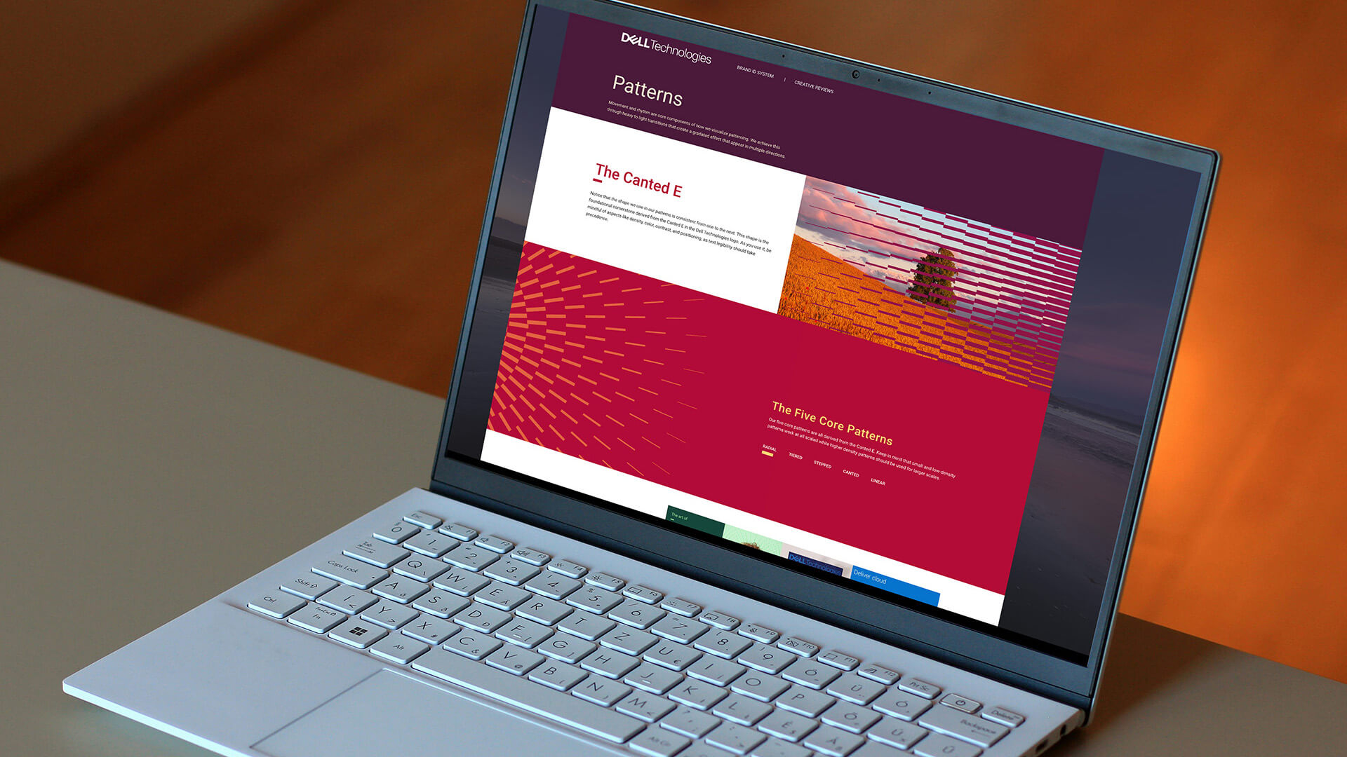
So every version ends up optimizing for these two, color values and brand assets. But they also carry forward the other stories that our brand team needs to tell. This latest version was FUN. We’re introducing Dell’s biggest brand update since the largest acquisition in tech history, making them a B2B player. Tone-on-tone color and 5 rhythmic patterns were the biggest change. Of course there are individual pages to talk about out using color and showcase the patterns, but we tried to use the layout of the pages themselves to demonstrate proper usage of these new elements. During the first few weeks of releasing the update, traffic soared to 5x daily visits.